¶ Overview
In Qwix the user-facing administration functions are implemented and managed by the Qwix Portal or in some cases the legacy Desktop application*
What views consist of and the features they provide is outlined below. A full list of Standard Views is also listed below for reference
*soon to be discontinued
¶ View Anatomy
Below is a brief overview of the parts that every view consists of. All views may not have every part, but they will at least have one of the fundamental parts.
A View has two primary functions:
- To present the user with data in a structured (grid based) format, so that the user may view, sort, filter and customise the data to their specific needs. This allows users to “interrogate” the data within Qwix to monitor, and manage processes and the data related to them. In addition to the data grids, users may also have access to Reports and Dashboards linked to the configured View.
- To Allow the user to action certain events, or manipulate specific parts of the presented data. This is done through the use of "Actions".
¶ Rules
When creating views in the Qwix framework there are some rules that need to be adhered to. The reason for this is because of the way the framework needs to use the data, particularly the sql in interfacing with the backend API. The rules are as follows.
Please note: If you have a data definition that can not follow all the rules. The solution is to add this as a SQL view first. Then select from this SQL view for you data definition in the Qwix view. Please use the naming convention of qx_Desktop_Name_of_your_view.
- When adding reports to the view
- Keep the reports from the same group together in the sequence
- You need to have an active view maintained
- When adding buttons to the view
- Keep the buttons from the same group together in the sequence
- You need to have an active view maintained
- Data definitions
- No sub queries can be used in the sql
- No UNION can be used in the sql
- No use of sql key words even if they are in square brackets
- E.g. FROM, DISTINCT, TOP
- Can’t use same fields more than once
- So can't join the same table twice, even if the fields are aliased
- On the views you can’t use field lookups
- This no longer supported in Qwix 4
¶ Grids
Grids are the heart of the Qwix system from an administration perspective. It allows users to view data, in a grid/table based format, with advanced features. in it's most simple form a grid has a number of columns and rows. Below is an example of a basic grid in Qwix:
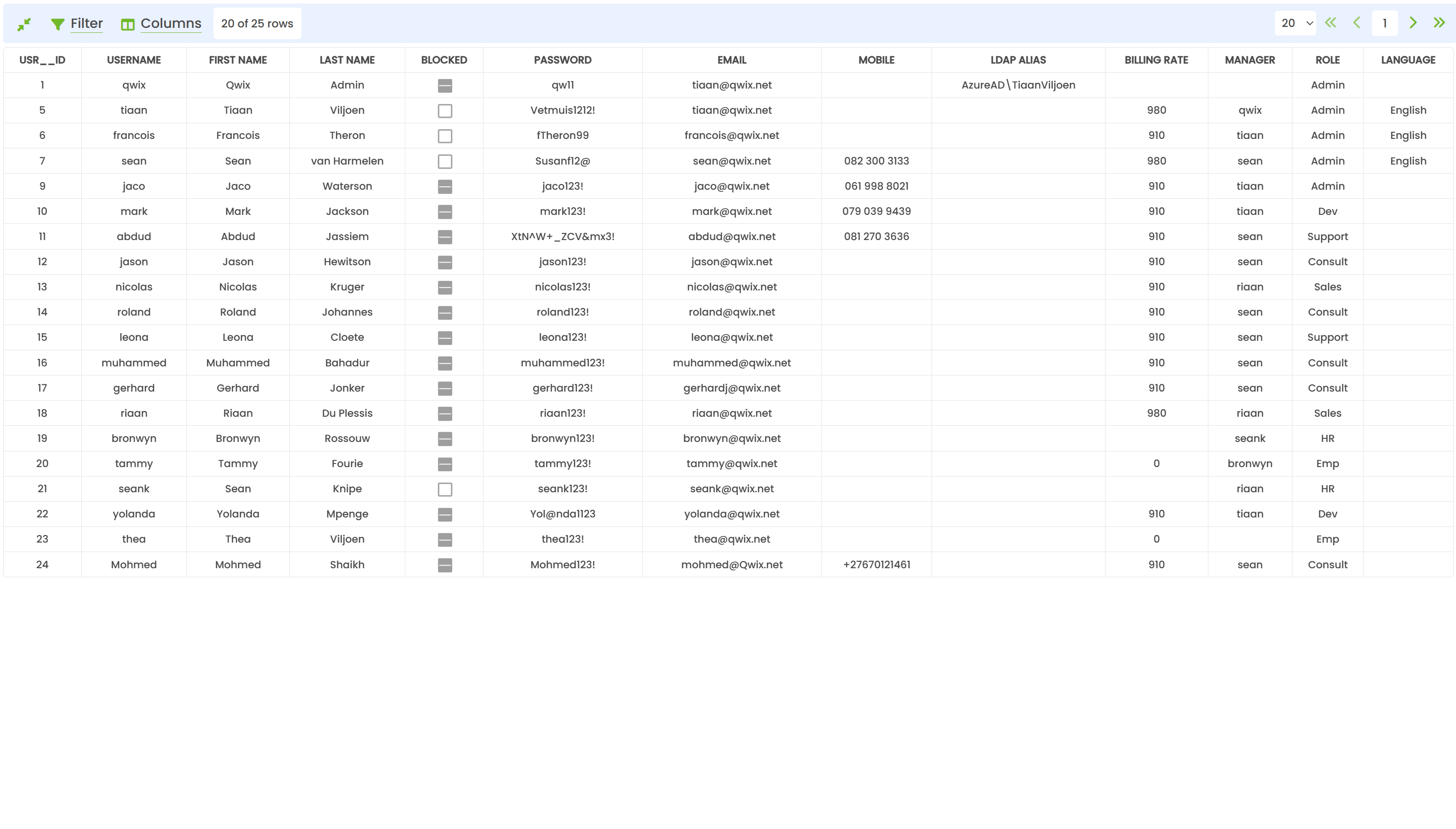
In this example, the User view is presented. A set of columns, presenting the available information for each user, and list of rows that list each user.
¶ Control Bar

The Control bar allows you to:
- Switch between normal and compact view
- Show/Hide the Filter bar
- Show the Columns Editor
¶ Paging bar

The Paging bar allow you to:
- Page to the <<FIRST, <PREVIOUS, >NEXT or >>LAST page
- Select the number of records to show per page. The default is 20, and the range is between 10 & 100
¶ Column Header Row

The Column header row shows the Captions of all the columns over and above showing the captions of columns it allows the user to perform the following functions:
- Resize Columns. To resize a column hover the mouse over the line that separates two columns, and move the mouse to resize the column. Resizing will resize both columns to the left and the right of the line at the same time.
- Move Columns. To Move a column, hover the mouse over the column header, click and drag the column to the new position. You need to drop the column between two other columns.
- Sort Columns. To sort the grid by a specific column, simply click on the column caption. An arrow will appear indicating the sort direction. Double-click on the column to remove the sorting applied. The grid can only be sorted by one column at a time.
¶ Compact View
Clicking this button will toggle the grid mode between normal and compact mode where normal mode is the default state. The default state is configurable in the Settings menu.
- In normal mode, large text bocks will wrap, and the row size will grow accordingly. Rows will often end up spanning multiple lines, and not be consistent in size. The advantage is that all text for an individual row is visible at a glance.
- In compact mode, all text fields will only show the text (single line) that fits within the column width. All rows will be the same height and present more consistently. To view the full text within a cell you simply have to hover your mouse cursor over the abbreviated text cell and a tooltip will display the full text.
¶ Filters
Clicking on the filter button will enable or disable the filter mode. Hiding the filter bar will also disable the filter that is currently applied. When the Filter mode is enabled, an additional row will appear below the column header row as shown below. If filters for a view already exist, they will be applied when the view loads and the filter bar will be shown automatically.

The Filters for grids can be quite useful, and have the following general features:
- Filters remain persistent (saved in browser cookies)
- Dedicated filter editors for DATE, TIME, BOOLEAN (checkboxes)
- Filters can have simple or complex expressions (Text and numeric fields only)
- Filters case sensitivity follows database collation. Mostly case insensitive.
Given the following example row values:
TESTING
WIP
OPEN
The most basic filter is to enter a simple text expression. Entering “tes”, will return the TESTING row, since the grid automatically applies the LIKE wildcard operator (%) by default. So that the filter string looks like this: “tes%”
Additional LIKE syntax can be added as you see fit. Examples:
- “%EST%” will also return the TESTING row, as the wildcard is now applied before and after the filter criteria
- “%EN” will return the OPEN row.
Logic operators can also be used within filter strings:
- > can be used: “>5” or “>TEST”
- < can be used: “<10” or “<OPEN”
- >= and <= can also be used
Finally, you can use the | (OR) operator for composite filters:
- “Tes% | ope%” will return both TESTING and OPEN
- “TEST | OPEN | WIP” will return ALL the above rows.
- “>5 | < 2” will return all values greater than five and all values less than 2.
¶ Edit Columns
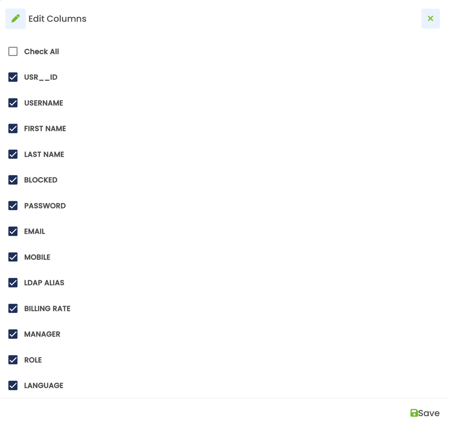
Clicking on the Edit Columns button will present the user with a dialogue where you may make columns visible or invisible in the grid. Simply check the checkbox next to the columns you want visible, and uncheck the columns you want to hide. Alternatively, check/uncheck the ‘Check All’ checkbox to update or reset all columns. Click on the Save button to apply changes. Column visibility remains persistent. A notification in the top-right will inform you of any errors such as saving without making a change or saving without at least one column left as checked.
¶ Tabs

At the top of each view, a list of TABS will appear. They will list the actions, reports and dashboards related to the view
¶ Actions
The Actions TAB presents a dropdown menu when clicked. Clicking it again will hide the menu
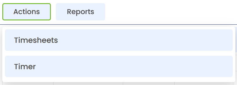
Initially, only the groups within the action menu will be displayed. Clicking on any of the groups will expand the actions within and at the same time collapse any other expanded group.
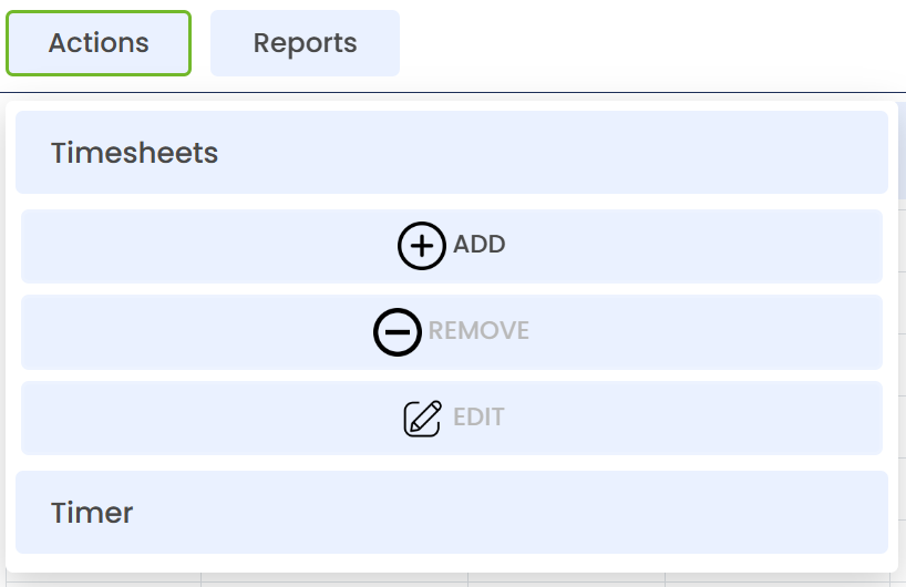
Actions will only be enabled under the following conditions:
- The correct active view is selected (in the case of master-detail grids)
- or the action does not require any records to be selected
Actions that require records to be selected may be executed with one or more grid rows selected. The behaviour is slightly different, but intuitive when selecting multiple rows.
Clicking on an action will then execute one of the following types of actions:
¶ Execute Action
A Simple action that will confirm that you want to execute the action to prevent accidental execution. After execution, it may present additional feedback in the form of a message dialog.
¶ Parameter Action
This action will first present the user with a list of values that need to be entered or selected, before executing the action. Validation of the values will be performed, and additional feedback or error messages will be displayed.
If the provided parameters were accepted and the action executed successfully the dialog will be closed and an additional message box may be displayed for feedback. If the action cannot be completed successfully, or the provided parameters are inadequate or incorrect, a dialogue box with the error message will be displayed. After closing the dialogue box, the parameters dialogue will remain, giving the user the opportunity to correct the parameters or cancel the execution of the action by closing the parameters dialogue.
If the Action is dependent on rows being selected, the following options may apply:
- EDIT action. When the Action is set to be an edit action, the values in the parameter dialogue will be automatically populated from values within the selected row, where the column names match the parameter names. When multiple rows are selected for an edit action, the values are NOT populated automatically. In this scenario only the values that you populate/change from default will be applied to all selected rows, the other values will NOT be edited for the selected rows
- Multiple rows selected. The Action will be executed independently for each selected row with the same provided parameter. Additionally, when editing multiple rows and clicking save, another dialog will appear where you can review the changes and see how many rows will be updated. This acts as a final confirmation and can be closed to continue editing if a mistake is spotted.
¶ Grid Action
The Grid Action type functions the exact same way as a Parameter Action, but instead, you may be provided multiple rows of input, or edit multiple selected rows simultaneously.
When such an action is NOT an EDIT-type action, you can do the following:
- Add a row by clicking on the +Add button at the top of the form. This allows you to ad an additional row and provide parameters.
- Delete a row by clicking on the bin icon next to any row. You can remove any added rows as long as there remains at least 1 row. A top-right notification will inform you when trying to delete all rows.
When the action is EDIT-type action, each selected row will create an individual pre-populated row in the dialogue. Allowing you to “edit” multiple rows simultaneously.
Upon clicking the SAVE button, each row will be actioned individually. The result of each row is displayed to the right of the row.
Any unsuccessful rows will be indicated, and the parameters may be adjusted. Clicking on the Save button again will ONLY post the unsuccessful rows again.
¶ Reports
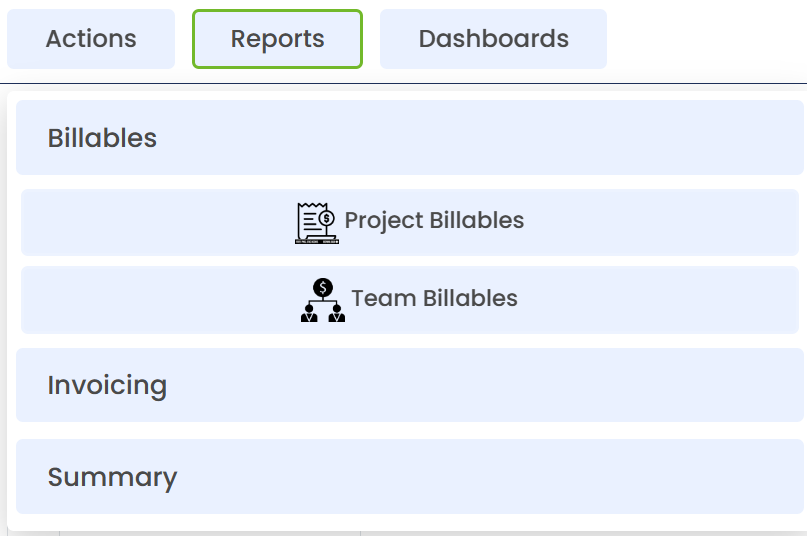
Just as with the Actions menu, the reports are grouped, expanding a group will present the available reports
Reports may also be configured to require a selected row and will execute the report and pass the KEY of the selected row to the report engine.
Reports will open in a new browser tab.
See Reports for more information
¶ Dashboards

Dashboards function almost exactly the same as reports within the context of a view.
Dashboards will open in a new browser tab.
See Dashboards for more information
¶ Views
¶ Inbound
- Purchase Orders
- Production Orders
- Customer Returns
- Branch Transfers
¶ Outbound
- Sales Orders
- Supplier Returns
¶ Manufacturing
- Production Orders
¶ Housekeeping
- Stock Take
- Inventory
- Hold and Expired Stock
- Expired Stock Picking
- Pallet View
- Scanner Monitor
- Replenishment
- Replenishment Estimator
- Replenishment Instructions
- Pallets
- Inventory Transfer
¶ Transport
- Delivery Management
- Deliveries
- Collections
- Trips
¶ Security
- Users
- Roles
¶ System Maintenance
- Item Master Maintenance
- Item Classification
- Items
- Item Categories
- Bin Master Maintenenace
- Locations
- Rules & Relationships
- Classification Relationships
- Scanner Maintenance
- Scanners
- Scanner Groups
- Customers
- PND Location Relationship
- Principles
- Batch Management
¶ Configuration
- Modules & Features
- Barcode Format Settings
- View Designer