¶ Overview
The Qwix Web Portal is used to Monitor and Administer the Various Qwix Modules, Features and Processes. The Portal accesses the Qwix Database via the Qwix API Layer
¶ Logging In
Through the built-in Role-based security, Users log in to the portal via the Login page.

¶ Login Process
- Enter your username as supplied by your administrator
- Enter your password as supplied by your administrator
- Click on the Login button
- A small notification on the top right will provide any feedback on login
- Notification on password expiry
- Notification on Licencing restrictions/session expiry
- Notification on invalid credentials
¶ Password Change
When logging in and your password has been marked as expired due to password policy, you will be directed to the change password page:

- Enter your current password
- Enter your new password
- Confirm your new password
- Click on the Reset button
Notes:
- Password complexity rules need to be adhered to
- The new and confirmed password must match
- A visual indicator will reflect new password strength
- A notification in the top-right will inform you of any errors
¶ Administration
Roles and Users can be managed through the Security Views by your Administrator
¶ Main Page Layout
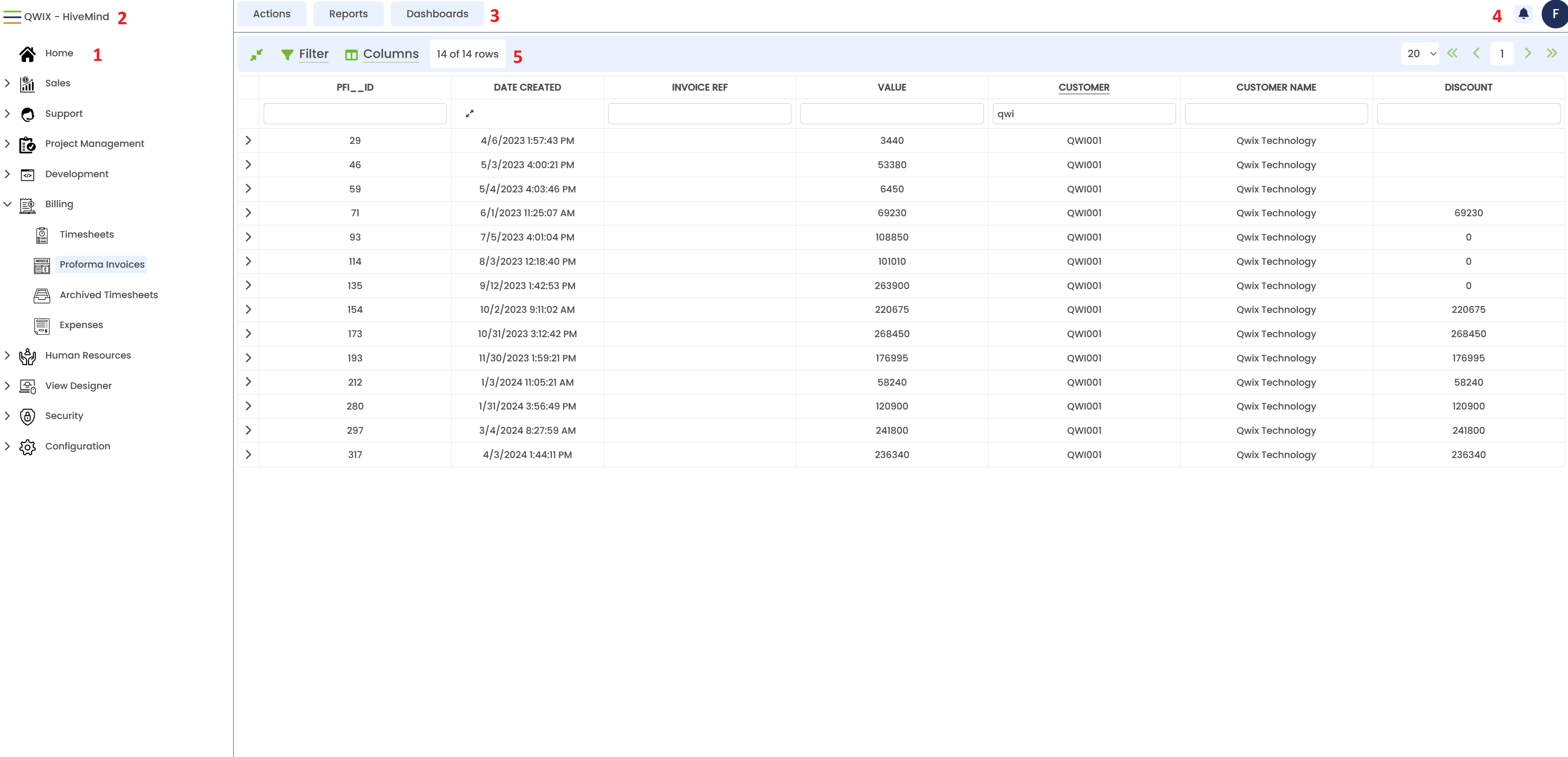
The Qwix Portal is broken up into five sections/frames. Below is the description for each of these sections
¶ 1. Navigation Bar
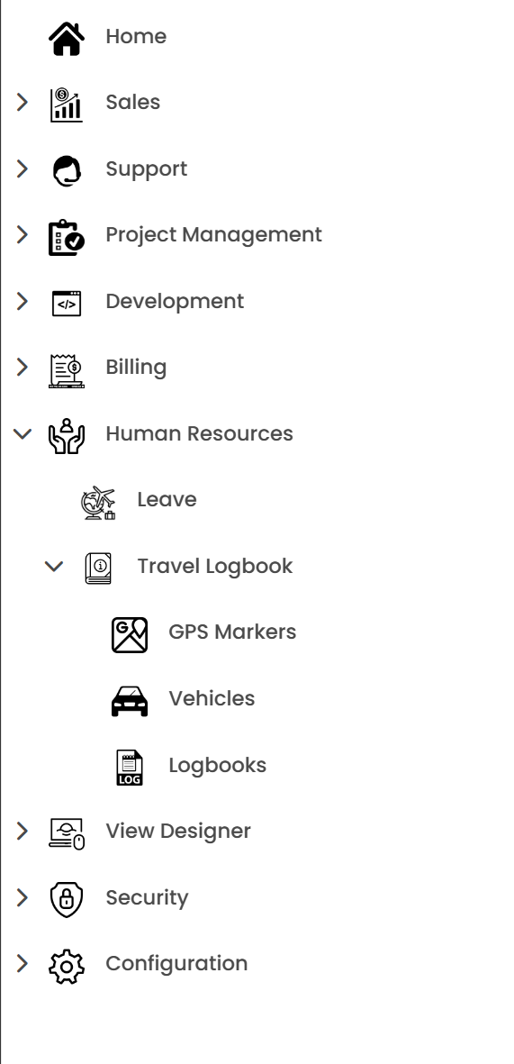
The Navigation Bar lists all the Views that can be accessed by the logged-in user. The navigation bar is in a menu-like structure. Some navigation items may have navigation items within them.
Clicking on a root parent navigation item will expand it to show its children. Clicking on another parent item will collapse any other expanded parent item.
Clicking on an appropriate navigation item that is configured as a View, will load the configured view into the View frame.
¶ 2. Site Name

Just to the right of the Navigation bar, you will find the site name. This is configured for each system. If you are connecting to multiple systems this is a clear indication to show which system you are connected to.
To the left of the site name, you will find three coloured stripes (hamburger). Clicking on the hamburger will collapses the Navigation bar to only show icons. Hovering over an icon will display the name of the menu in a tooltip. The Navigation menu's default state is configurable in the Settings menu. The hamburger will then change into an X.

Clicking on the X will show the navigation bar again.
¶ 3. RAD bar

The RAD bar is an acronym for Reports, Actions, Dashboards.
Each of these buttons hides a menu for the respective items they represent. Clicking on the Button will present the menu.
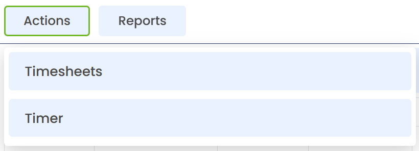
The menu items are grouped, and clicking on the group will show its menu items:
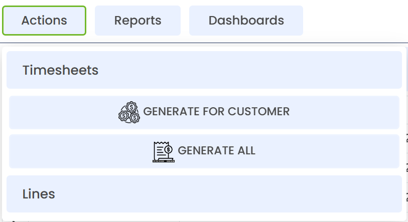
To learn more about the RAD components, please see
¶ 4. Notifications & Profile Menu

On the Top Right of the Main page, you will find the Notification Bell and the Profile menu:
¶ Notification Bell
The Notification bell will show a red dot over the bell if you have any unread notifications. Clicking on the bell will display a window with a list of notifications.
Notifications are implemented as a communication method for some implementations as requested. The notifications are specific to that implementation.
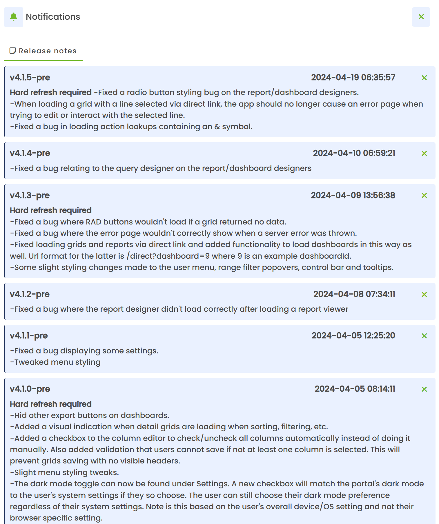
The notifications will appear in chronological order from most recent. Each notification has a title, notification date/time and a body.
Clicking on the body of any notification message will mark it as read. If you have no more unread notifications, the red dot will disappear from the bell icon.
Clicking the X (close) icon for any of the notifications will remove the notification completely.
¶ Profile Menu
The profile menu is identified by a round circle with a single character in it. The character will be the first character as configured for the logged in user's name.
Clicking on the Icon will show the profile menu:

¶ 1. Settings
Accessing Settings
The Settings window contains preferences for the current user's QWIX experience. It is accessed from the user menu in the top-right corner of the application.
Select the circular user icon in the top-right corner of QWIX.
Select Settings from the user menu.
The Settings window is divided into three sections:
| Personalisation | Appearance and general display preferences |
| Grids | how data grids, filters, columns, and detail headers behave |
| Account | Account actions, including changing your password |
Click on the individual items to open up the relevant settings.
A. Personalisation
Enable dark mode
Changes the QWIX interface from the standard light colour scheme to a darker theme. This may reduce glare in low-light environments.
Match system settings
Uses the light or dark appearance configured in the user's operating system or browser environment.
Expand menu
Controls whether the main navigation menu on the left is expanded by default. When enabled, menu labels and available submenus are displayed more prominently.
Text size
Sets the text size used in the QWIX interface. Enter the required numeric size in the field. The default is 12. A smaller selection like 10 allows for more information to fit on the screen within grids. This is especially helpful when grids contain many columns, or you actively view grids with many rows or detail tabs
Detailed error page
Displays additional technical information when an error occurs. This may be useful for troubleshooting.
Date format
Selects how dates are displayed in QWIX. The available formats are dd/MM/yyyy, yyyy/MM/dd, and MM/dd/yyyy. For example, 22 July 2026 appears as 22/07/2026, 2026/07/22, or 07/22/2026.
Open widgets by default
Controls whether supported widgets are expanded or opened automatically when a view loads.
B. Grids
Show all grids in compact mode by default
Displays grid rows using reduced spacing so that more records fit on screen at once. Multiline data in the grid will be trimmed. To view the full text, simply hover your mouse cursor over the text box.
Apply filters on detail views by row
When this setting is enabled, the filter of expanded details views will operate independently. If the setting is disabled, then the filter is applied to all detail views that get expanded. The same filter is applied to all of them.
Enable saving of recent filter values
Allows QWIX to remember recently used filter values so they can be reused later. This will then appear in a dropdown list below the filter box when typing a filter value. When this setting is disabled, the recent filter list will not appear as you type.
Apply grid filters after a slight delay
When this setting is enabled, the filter will be applied automatically as you type after a short delay. If the setting is enabled, the filter will only apply when you hit the ENTER key or TAB key.
Grid Storage Management
Select Open beside Grid Storage Management to view saved grid filters or sort orders. If the user has no saved items, QWIX displays No saved filters or sort orders. From here, you can remove any corrupted grid storage entries or reset them when needed. This is especially helpful after the view design has changed.
Enable free resizing of grid columns
Allows the user to resize grid columns without the normal sizing constraints. When this setting is disabled, the width of grid columns is restricted by the width of the screen, and the total width of the grid can not exceed the width of the screen. When this setting is enabled, the grid may extend beyond the limits of the screen border, and the grid columns may be made much wider. A horizontal scroll bar will appear below the grid to scroll across the columns.
Align text data to the left and numeric data to the right
Applies conventional alignment to grid values. Text is left-aligned and numbers are right-aligned, which can improve readability and numeric comparison. Normally all text is centered.
Keep detail headers visible as you scroll
Keeps the header area of a detail view visible while the user scrolls through its content.
Account
Figure 5. Account settings
Change your password
Select Change to begin changing the password for the current QWIX account.
Closing Settings
Select the X in the top-right corner of the Settings window to close it and return to the current QWIX view.
¶ 2. Report Designer*
Clicking on this menu item will load the report designer in a new window/tab.
See Report Designer
¶ 3. Dashboard Designer*
Clicking on this menu item will load the dashboard designer in a new window
¶ 4. Import File
Clicking on this menu item will load the File import module
¶ 4. Logout
Clicking on the logout icon will log the user out, and go back to the login page.
* Administrator access is required for these items
¶ 5. Views
In this frame, the currently active view will be displayed. To learn more about views please see Views